Seamless white… is not
I am working a lot in the studio for my stock submissions. I pick the objects around house, or food items, and try to photograph them in an interesting way on white, isolating background. It took me a while to realize that such a simple concept is not as simple after all.
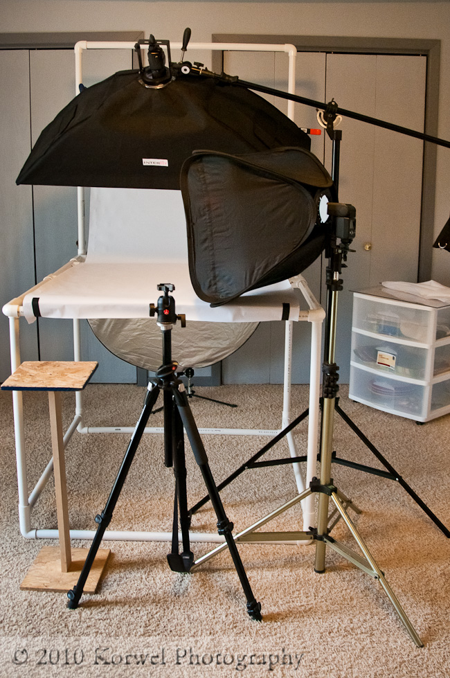
During my first months of submissions, it seemed not to be a problem, but after a while Bigstock started to complain that the white background was not as white as they wished. And from there, I was trying to go both ways. I considered the setting the lights right “the easy way”. More then half of the year passed, I have fourth or fifth studio setup, and with two flashes and a reflector, still some part of the image is grey. I have one softbox above the setup, directed on the white background behind the subject. I have second softbox on the right and to the side, it is my main light for the subject. Reflector and number of white cardboards and mirrors are filling the shadows on the left of the subject. In best case scenario, the front of the image is dark :). I tried so many layouts, that I simply run out of ideas.
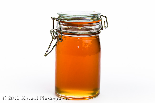
Eventually, in the act of desperation, I mean from the desire to learn, I went to watch a Jim DiVitale class on commercial photography on Kelby Training. That is what I used as a starting point to organize lights in my latest portable studio (meaning easy to disassemble when the place is needed for guest bedroom). I don’t think I went any further then lesson 4, when he basically did what I consider “the hard way”. He went to Photoshop, selected the whole object and whitened the lightly grey background. Seriously? It takes time, it takes patience, and some subjects are just almost impossible to isolate this way. Example? Try doing that with a branch of the pine tree. And even for simple items, like this jar of honey, it takes some practice to refine the edges that the difference between the whitened background and the object is not obvious. I am still trying to figure that out.

