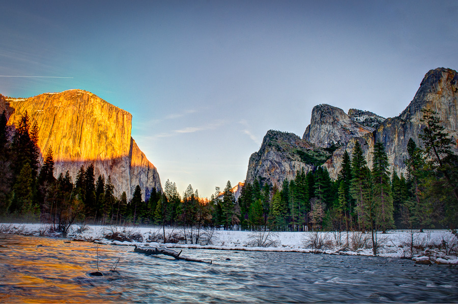
Yosemite view (Before & After)
Similarly to the stairs post from two weeks ago, todays image was not taken by me. RC Conception shared again a set of his RAW captures for his blog readers and Google + followers to post process to their liking.
I was very hesitant to do it once again. After all, I feel most of the photography is done in the camera, not in post. I have not taken the image, thus I should not showcase it. But I really liked the image and wanted to do some work on it to give “mine” feel to it. Maybe one day, I will have a chance to visit Yosemite and make a similar photograph myself, like many photographers did before. Right now, I was admiring the contrast of the sun-lit and covered in blues shadows in the scene.
For tone-mapping in Photomatix, I took 8 out of 9 frames provided. I skipped the darkest one, in which I could not see any detail. I used for the first time one of the Fusion presets as a starting point. My image is grittier then RC’s interpretation, and I like it – especially in the details of the rocks. There is also more light on the trees in the middle of the frame, which makes the scene less moody, yet pleasing. And this branch on the right.. it was a real pain to remove it, yet the picture is so much cleaner without it. But compared to RC’s image, on mine you can hardly see another mountain range in orange sunlight behind the trees. It is lost here… and I am not sure why.
Which version of this image do you like more and why? Share in the comments, or head over to RC’s blog to download the RAW files and create your own interpretation of this classic Yosemite scene.
