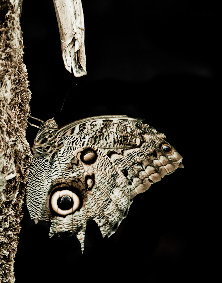
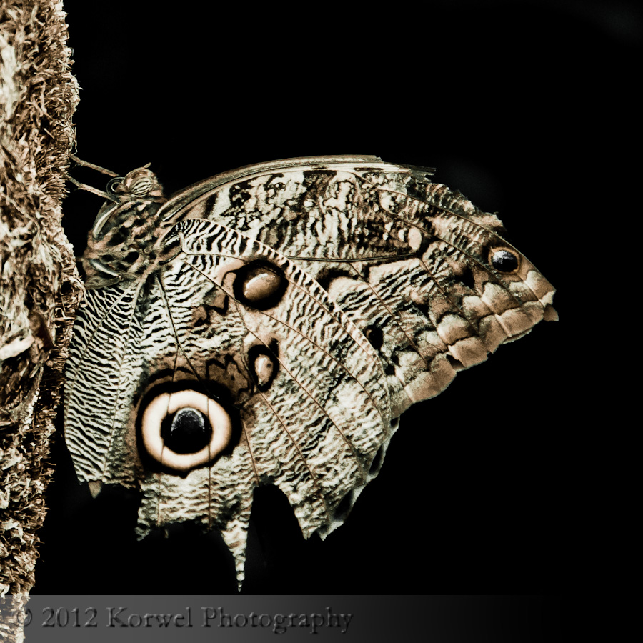
Owl butterfly (Before & After)
The “Before & After” series is a combination of two things. It is for readers to learn a technique and take a critical look at one of their images and utilize the technique to improve it. For me, it is a chance to revisit some of my old images and improve on them now, with more experience in both shooting and post-processing.
Sometimes the images for “Before & After” pop up when I open my Lightroom catalog and accidentally move some early images. Sometimes, when I happen to open an old blog post, while searching through blog. And quite often, it comes from looking at the prints. I am not printing many of my images, but the State Fair contest entries are hanging all over my house, home and work office. I often stare at them, thinking about something else, when the idea sparks. It was the case with the Boats, and it is the case with todays image.
The older the image, the easier it is to fix. And to understand why the entry was not successful.
The “Owl butterfly” is a nice image. I like the texture on it. I like the mood, and the simple dark background. But I totally cannot understand why would I leave this white distracting branch on the top. It is not adding anything to the story, and cannot be fix easier. I didn’t even had to use Content-Aware Fill or even Cloning in Photoshop. With black background, I just used Local Adjustment Brush with Exposure at the minimum setting. And cropped square for more impact, something cannot be done in a contest entry, which needs to be 11×14.

