Pick your ratio and more about cropping
The idea for todays post came from listening to the recent LensWork – Photography and the Creative Process podcast. The podcast is a series of short, single subject essays by Brooks Jensen, editor of LensWork magazine, which I mentioned on this blog many times before.
Unfortunately, as of March 2012, you cannot easily access the archived episodes, so no update in the link. Sorry.
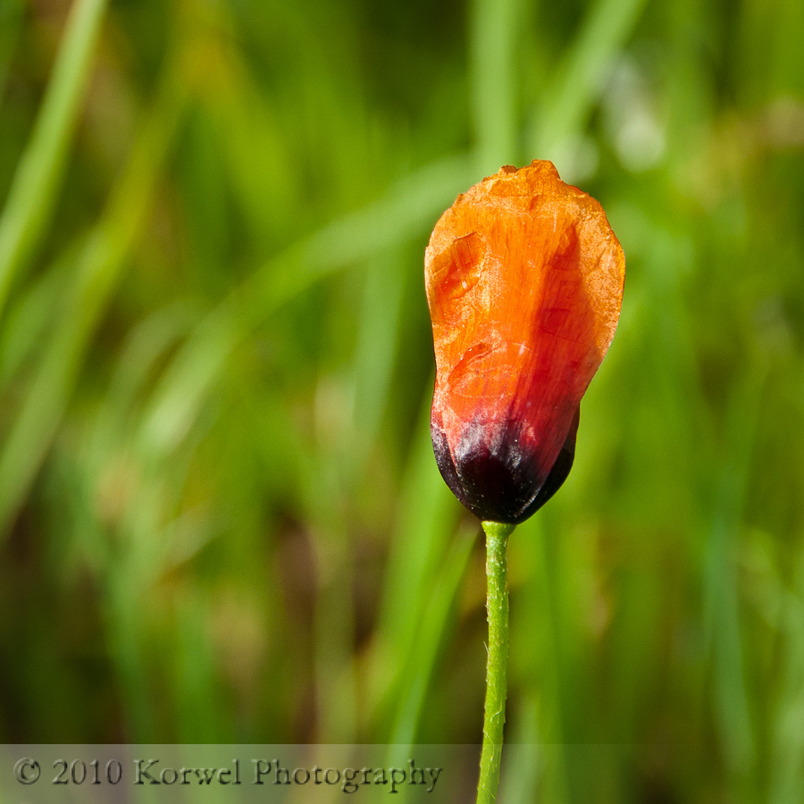
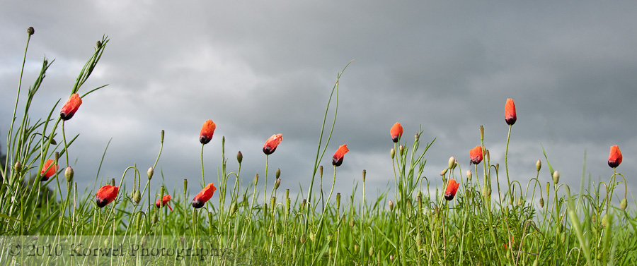
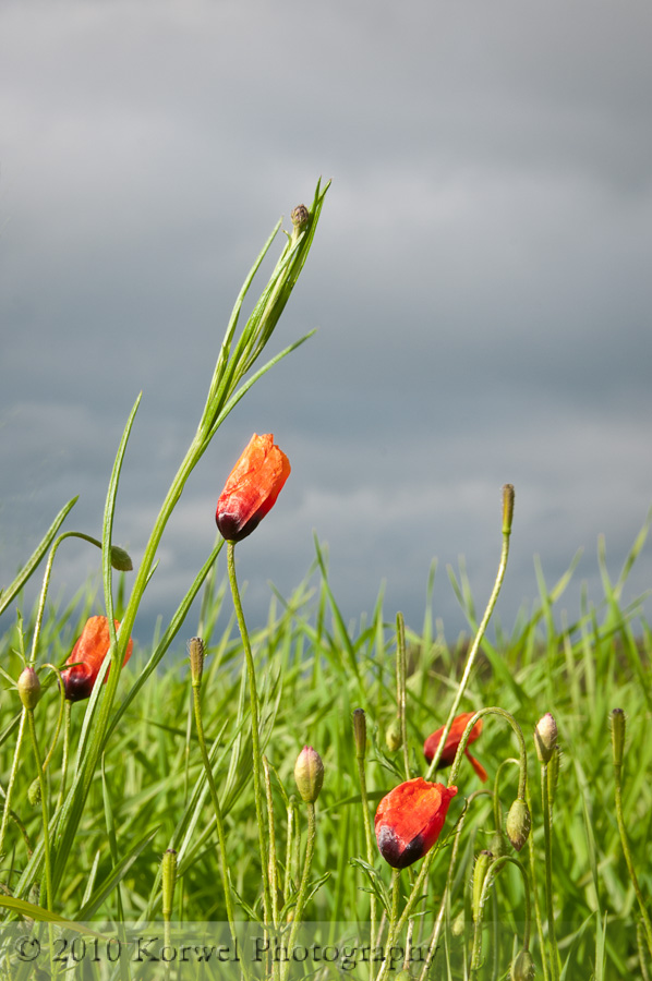
Example images for today’s post are from my poppy field series I photographed in May last year in Poland. Poppies are often found as wild flowers in small patches within crops all around country. That day, it was raining (it was raining all May last year in Poland :( ), so the dramatic dark and heavy clouds provided great backdrop for the images. All images are clickable, if you would like to see a larger version!
The aspect ratio of the images depends on type of camera you have. My Nikon D300 takes images 4×6. But I can change the ratio to anything I like in post-processing software by cropping. This is very often a way to compose the image after the fact. Not the smartes way, but I am sometimes guilty of it. Most of the cropping I do involves just removing a bit of margin here and there, with ratio retained (or “locked” with a padlock in Lightroom). There is a few more “locked” ratios than default 4×6 I use, with a clear purpose. For example, if I need to reduce maringin only on sides or only on top or bottom, but I do not want to loose the image area in other direction, I will use 5×7 ratio. It is still a “classic” ratio, or at least a typical print size, although I don’t see this particular ration mentioned in the great summary article on Wikipedia about image ratios. I am also quite often using 1:1 aspect ratio, for single subject photographs, especially for microstock, when the agencies complain about too much empty space around the subject. I also sometimes try “custom” aspect ratios, by “unlocking” the padlock and just removing unneeded space out of the image. I am fluctuating between considering it an “artistic freedom” and “crime against aesthetics”, thou. I am in the latter period right now :).
Now, interestingly, I never paid much attention to the fact, that panoramic images also have, or should have, certain aspect ratio. Typically I would merge all horizontal or vertical (I started doing it last year) images into panorama and then just cropped out “white” unfilled spots. Lesson learned for the future now, and couple of custom ratios already added to my presets- 1:2.39 and 1:1.85. After all, looking at disproportional panorama is equally unpleasant as looking at a dominating tree not positioned exactly where rule of thirds dictates.
I guess I should also mention that croping or composing image in the camera horizontal versus vertical and that it influences the appearance of the image. Also, some subjects simply look better on vertical images, especially if they are, well, vertical. It help isolate and draw attention to them. Probably a single compositional technique I was born with is to know when to turn the camera and take a vertical. So it hardly ever happens that I need to crop the image in post from horizontal to vertical. But framing the image appropriately in camera is a cropping option, nevertheless.
And last but not least, who said the image has to be rectangular at all? I have not tried it myself yet, but I remember beautiful portfolio by already mentioned Brooks Jensen “Uchiwa-e” (click on link to download and browse the pdf portfolio). But, even with an unusual shape, those images keep one of “classic” aspect ratios.
How about you? Do you have any thoughts on cropping images? Do you tent to remove distracting areas from your images without retaining the original ratio? Or do you always crop in camera and never need to worry about it in post-processing? Or, maybe you never change the ratio of images, and keep it as it came out of camera? Let me know in the comments section.
UPDATE – Michael Fry just did a post on his blog, in favor of cropping to taste, not a classical ratio.


