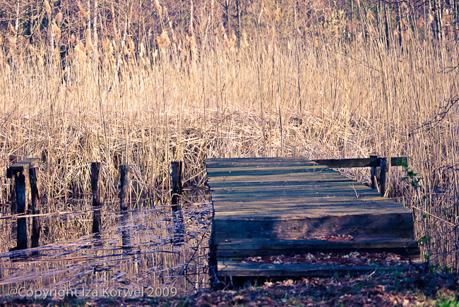
Deck in split-tones
It seems like “Hot shoe diaries” fuss calmed a bit. Probably because now everybody is reading “Within the frame” by David duChemin. Since my purchase request in local library got approved this time, with a processing time about a week and a half or so, I have the book on my desk as of yesterday. I want to finish whatever I am reading right now, not photography related, BTW, I just flipped through pages to see what’s awaiting me. And I got captivated by the split-tone images from India. I have seen different combinations of colors for split tone, but yellow and violet just looked so … original? I decided to try it on some of my images. In the process I discovered that the right photo makes all the difference. This one was by far the best. Mind you, I did not use the original hues, I just went with something matching the photo the best.
