DPS Monthly Edits December 2009
Something new on a post today. It is not a guest post per say, but featured image was not taken by me. I decided to take part in Digital Photography School Monthly Edits challenge, and instead of just posting a comment on the web page with the final image, I decided to write a post on my blog about how I achieved the final effect.
I basically like the image and how it was post-processed. I love the colors, and I though I will try to make them pop up as well. What I wanted to tackle is how the mountains disappear in the distance. I want to see their shape distinct rather then bare suggestion they are there, and it is a main reason I decided to take part in the challenge. Overall, the image lacks contrast in the top part.
I spent three evenings trying to make it “my way”. I started from basic black and white conversion, which was not interesting at all. Then I tried a single image HDR to recover some of the mountains and maintain detail in the bird, but I created just too much noise and overall did not like the result. I tried to add a split-neutral density filter on top part, and I wasn’t able to recover as much as I wanted before the noise set in, but it felt like I was onto something.
In this moment, I created several virtual copies and was just going through sliders, and I had hard time recreating what I did when I had a final image. So I had to go back and start from the beginning, writing down each step.
First I took the image to Photoshop as Smart Object, made a copy of a smart object, and using Camera Raw, adjusted top copy to +1 and the bottom copy to -2. The top layer blending mode I chose to set to Overlay, by trial and error. It worked, I had enough detail in the mountains. I actually just saw the trick on Photoshop User TV episode 211. I made another copy of the smart object with Exposure as it was originally, created a layer mask of the shape of the bird, and with Normal blending mode, lowered the opacity to 37% to lighten the bird without it being to obvious. Uff, it was complicated.
Back in Lightroom, I added some Clarity and Vibrance and placed a graduated filter on the sky. I made it -0.6 stop and added an orange color, picked from the sky itself. Another graduated filter, light blue, I added to the bottom part. I cleaned few spots (probably post-processing artifacts) and added +0.5 in exposure to the whole image. I also cropped the image so the bird was in one of nodal points of rule of thirds grid. To finish off, I added some post-crop vignette and sharpened a bit.
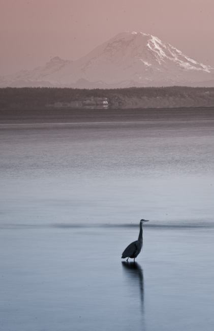
It would be it, if I didn’t try to turn it black and white again, and discovered that the color in my graduated filters was preserved in the conversion.
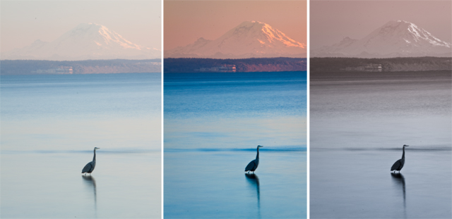
You can see the original image, the final full color version, and my favorite, colored black and white.

