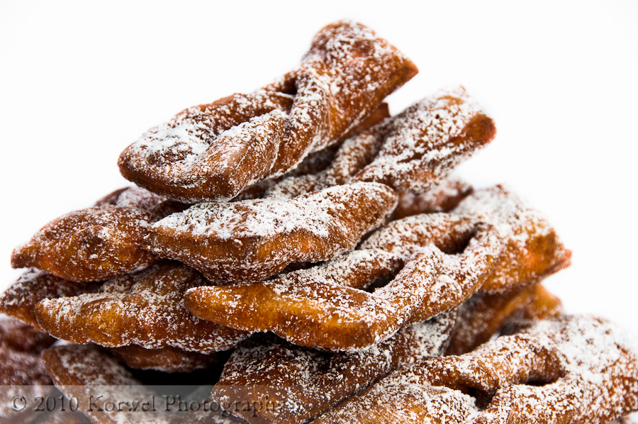
Faworki
I got so busy yesterday, that the post just did not make it on blog. And almost the same would happen today. I guess I owe some kind of explanation. As those who visit the site can see, the blog went into another overhaul. And those who use a reader like NetNewsWire or Outlook, might want to poke at the site from time to time :). Some of you might have seen me wondering on Twitter if I should change the theme because I saw somebody else using it. It felt really strange landing at somebody else’s site and seeing well, my blog. Yes, there is content and so on, but it still felt strange. Since then, I have seen the same theme being use on at least three other blogs. And I understand why- this theme was so graphically perfect and so well prepared for widgets- I loved the fact that it had both side column and a footer. Most themes have either, well, most have side columns only. But the truth is, it is not the reason I decided to change how the site looks yet another time. I sometimes publish more fancy things then pictures- movies, slide shows, galleries or panoramas in Zoomify- all those objects were not fitting well in very narrow main column of the theme. So I went into other extreme, and now I have very wild column, which I love. And the graphic stays (I love you, Tomasz :) ).
And today, an image of faworki, favorite Polish dessert served during whole Carnival period. It is basically shortcake, deep fried. Let me know what you think about this image. Is it too close? Too low of an angle? DO you enjoy those type of intimate food photography as I do, or you prefer the angle and distance of person sitting at the table?
