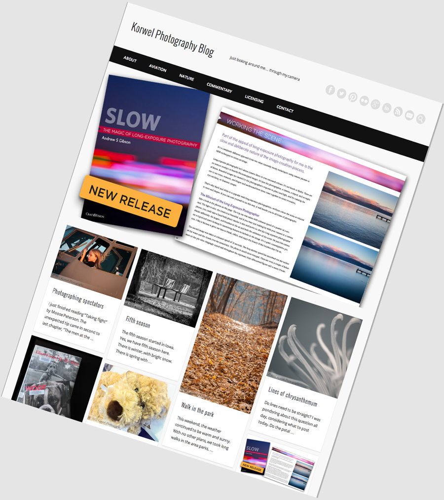
Introducing KorwelPhoto blog 2013
If you do visit this blog by opening the site in your browser, rather then through RSS feed, midday yesterday you were greeted with this new look. If you are only checking your RSS feed, I encourage you to check out the new blog design at www.korwelphotography.com.
It feels I have the tendency to do blog maintenance around Thanksgiving holiday :). It makes sense, since I was not raised in this culture, the holiday has no meaning to me, yet I am graced with few consecutive days off at the time of the year it doesn’t make much sense to undertake longer travels. Thus I am stuck at my computer, looking for productive things to do.
This time, I decided that blog design was so 2010. Indeed, November 2010 was when the last major facelift happened. With minor tweaks, the blog looked like that until yesterday. In fact, behind the scenes, things were happening all week, with major cleaning up of Plug-Ins, deleting unused ones and replacing some with another approach.
If you take a look at the previous essential WordPress plug-ins post, probably half of them are gone. The worth noting replacements are new EXIF and Related Post plug-ins.
In the first case, the old EXIF plug-in was seriously affecting the page loading time with any new themes I considered. Now, you can find the EXIF data by hovering over an image with a mouse, and this happens regardless if the image is small or large. It also does not affect the other site features, for example you can still click on an image to see a larger version in Lightbox.
The new Related Post plug-in displays additional posts mostly based on Category, so less random posts are finding its way there. I also like how the thumbnails are displayed along with short excerpt pf the post. Its overall look fits perfectly with the new theme on blog.
And the biggest of all change- the new look. I was browsing WordPress themes for weeks preparing for this facelift. I needed a free theme, which would bring my blog to 2012, with featured posts and thumbnail-illustrated excerpts of recent posts. I was looking for a top menu, featuring the About, Contact and Portfolio pages. And I wanted it all look the same, regardless if you open it on your desktop, mobile phone or tablet. This particular theme has it all. The clean, simple design and fonts are exactly what I was looking for. And most of all- now when you open korwelphotography.com you know right away that the site is about images!
Please take a look at the new design, and let me know what you think. Do you like the new, simple and to the point look? Is there any functionality you used to like which is missing now?
