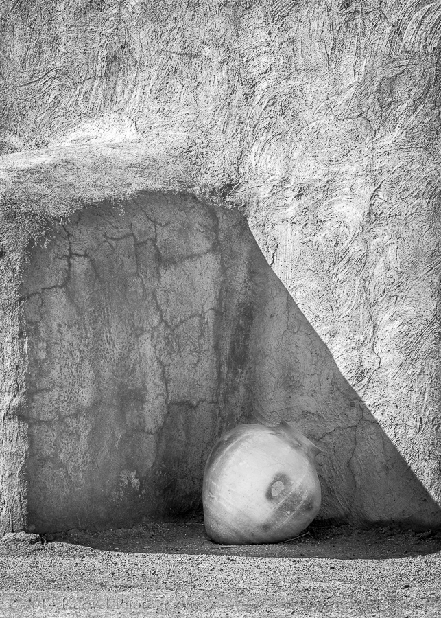
Old pot in a shadow of pueblo
For few days already I am struggling with finishing off this image. It did not look all that interesting in color, but the moment I turned it black and white, I loved it. I like the simplicity of the lines and shapes. It reminds me some of Georgia O’Keeffe work. Just focusing on what’s most important and characteristic of the subject. Yet I am still not happy with it. There seem to not be enough contrast. The subject is in a shadow, and while this is what I like about it, it is hard to improve on tones in the image. Any thoughts, anybody?
