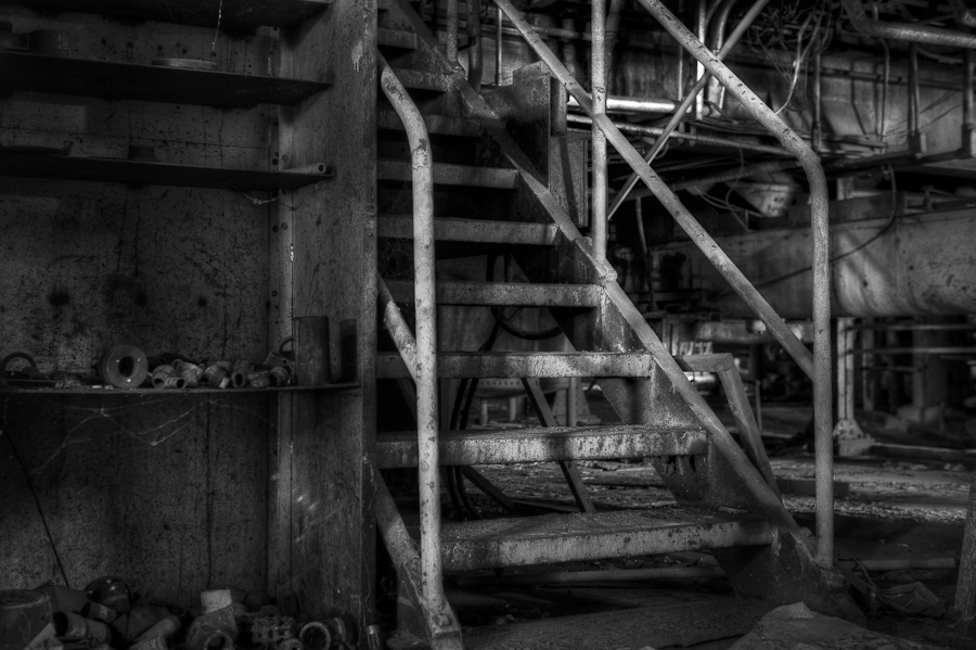
Stairs by RC (Before & After)
Today, there will be a little different post in the Before & After series. To see the Before image, you need to follow the link to RC Conception blog post here. He posted the finished image, as he interpreted it, along with a downloadable 5 bracketed exposures for the readers to create their own.
After studying if for a while, I had an idea how I want to post-process it.
There are few things I like about the image. The light on the rail. The overall texture of old metal objects and certain industrial feel to the whole scene.
There are few things I wanted to change. The crop, for once, and straighten those bit crooked verticals? The color. It seemed to me the black and white conversion would work just fine in thus image. I also really wanted to do something about the wall on the far left.
I started from taking all five exposures into Photomatix. I usually just take two extremes and the middle exposure, but it is sometimes good to try something different. There is a black and white preset in the Photomatix, and I used it as a starting point. From there, I went through Tom Till’s HDR steps to finish the tone mapping. Then, it was time for Lightroom. I increased overall contrast, and added some more on the rail, to accent it even more as the main subject. I like images like that, you can be really liberal with the use of contrast, and it still looks good.
To preserve the moody feel, I played with the tone curve. I also used a lot of Local Adjustment brush touches, to reduce the light on the background elements and mostly, the objects on the shelf in the left side of the image. Sharpening and a bit of vignette, and done.
